
Typography
The Endless Blue True Type FontMillions are spent by companies on packaging and design, trying to capture just the right look for a product. Brand name recognition comes as much from elegance of visual aesthetics as from the quality of the item itself.
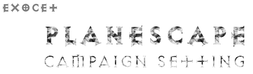
Two of my favorite gaming settings knew this and incorporated a distinctive look into their already incredible writing to produce two of the most memorable and endearing gaming worlds I have ever had the pleasure to read: Planescape by TSR/Wotc, and the Iron Kingdoms by Privateer Press. Aside from their incredible writing, both are known for the consistent, exceptional graphics used in their supplements. Perhaps most notable was each branded itself with a outstanding font that was used for its cover titles and interior headlines. Planescape utilized the commercial Exocet Heavy typeface while Privateer Press employed the freeware Wolf’s Bane font for their products.
I want to capture that same level of instant association with the Endless Blue setting, so I began looking for a typestyle to accomplish just that outcome. With some forethought, I had a few primary requirements the font first had to meet. The first of which was the font had to have a certain amount of “weight” to it. For example, the Exocet font comes in not just the Heavy typeface, but a Light as well. The Light version has the classic serif look and cross motif that we have come to associate with the font, but is thin lined more akin to normal writing; the Heavy version keeps the same look, but is thicker, fuller, more solid in appearance than even a bolded Light version would posses.

While both have the desired look, the Heavy version has some graphic design benefits that the Light lacks. By being a thicker line, a designer can apply other graphic effects that would be lost to the viewer on a thin line, such as texture.
As for the actual look of the font, I was reluctant to go with anything to explicitly “watery”. While thematically cursive and loops would suggest an aquatic feel, it also entails a certain egalitarian, almost snobbish connotation. Using such a font would make the work seem like a rather strange wedding invitation. This font, Waterways Seafarers by Jellyka Nerevan, has a very organic, undulating feel that comes to mind when thinking of waves and breaking surf. It exemplifies the ocean aspect of the setting, but it lacks the weight that fonts like Exocet Heavy and Wolf's Bane possess.

I looked elsewhere. I have always been attracted to much of the Art Nouveau movement, at least in terms of their design. I came across three fonts that had potential: Chelsea Studio, Dustine Solid, and Dyer.

What immediately drew me to Chelsea Studio was the “floating squares” and double cross lines. The line weight and curves unfortunately detract from the overall look, so I moved on to other typefaces.

Dustine Solid has a nice mix of curves and straight lines, especially in letters like P and R. However, there is almost no difference between upper and lower case letters. While the font I chose would only be used in titles and headers and thus wouldn’t really have much use for lower case, for creative sakes I wanted to have that possibility.

Dyer is very close to Dustine Solid in appearance, both the pros and cons. What I really liked was the line under the lower-case vowels, the weak curve of the lower case S, and how the second lines in the E and F extend out farther than the top. But still, the lower case had little difference from its upper case cousins, and the lower case i harkens back to the squares of Chelsea Studio, so...

I made my own. I am by a far means a competent fontographer, but by using typeface foundary software (FontCreator by High-Logic) and some Adobe Photoshop I cobbled together this True Type font, with the Dyer font as the core and altering it to include the aspects of Chelsea Studio and Dutine Solid I admired.

I added a few personalized tweaks, such as the sloped bars in the B, P, and R, as well as the flipped D/d and O/0. I toyed with a further version, that actually used lower case letters in the lower case spots, but while I meshed the style well with the upper case versions, the flow of letters in text was atrocious. So I reverted to this earlier version and now release it into the wild. I hope you find use for it, and if you can improve upon this primitive beginning please contact me and I'll update.
William James Cuffe


No comments:
Post a Comment